![Meowriosity[ミャリオシティ]](https://millmi.com/wp/wp-content/uploads/2018/09/cat-logo-e1580005474694.png)
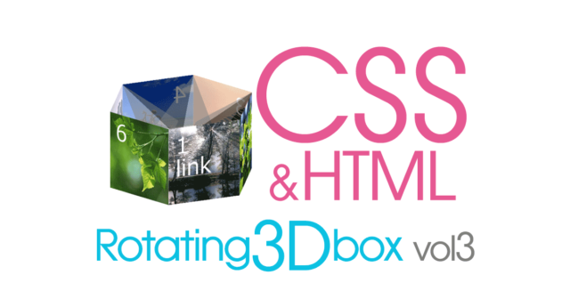
ここでは、6種類のバナーを載せられる、CSSアニメーションの横回転バリエーションと設定方法をご紹介します^^。
もちろんテキストやリンクも設置可能。
マウスホバーで動きを止めたり、STOPボタンも設置可能だから
使い方次第で、結構面白いサイトのアクセントになるかも?? かも^^v
ソースと注意点などはページ後半にまとめています。
※ ここで使用している translateZ は相対指定が出来ない為、固定サイズの3Dボックスとなり、フレキシブルにサイズを変える事はできません。
レスポンシブで利用する際はブレークポイントで調整する必要がありますm(__)m
同じテーマの記事
- CSSだけで作る「回転する3Dバナー/ vol1 立体の箱を作る」(コピペOK)
- CSSだけで作る「回転する3Dバナー/ vol2 立体の箱を回転させる」(コピペOK)
- CSSだけで作る「回転する3Dバナー/ vol3 6面の横回転サンプル色々」(コピペOK)
- CSSだけで作るレスポンシブ対応「アコーディオンスライダー」(コピペOK)
- CSSだけで作るレスポンシブ対応「無限ループスライダー」(コピペOK)
このページの目次
DEMO
マウスホバーで一時停止(pause)、マウスを話すと動き出します。
ここでは 動きを確認しやすいようボタンは初期位置に戻って止めていますが、一時停止ボタンにする事も可能です。
背景画像なので、テキストやリンクも自由に入れられますよ^^
1. 横長バナーのシンプルアニメーション
- 1
Link - 2
- 3
- 4
- 5
- 6
6枚のバナーをシンプルに横回転させています。
2. 縦に垂らしたバナーアニメーション
- 1
Link - 2
- 3
- 4
- 5
- 6
デバイスによる画面サイズの制限があるので、使いづらい気もしますが、、、
使い方によっては面白い表現になるかと^^;;
3. フワッと広がるループアニメーション
- 1
Link - 2
- 3
- 4
- 5
- 6
シンプルだけどちょっと目を引く六角柱型バナーです^^
4. 風車のように回るアニメーション
- 1
Link - 4
- 2
- 3
- 5
- 6
バナーの羽根にカーソルを当てた時、どこを指したか分かりやすいようにタブが出現します^^
5. 内側もオシャレなループアニメーション
- 1
link - 2
- 3
- 4
- 5
- 6
liに疑似要素で屋根を付けたバージョン。奥側のリンクが反応しなくなります^^
HTML
5種類のバリエーションは、全部同じリスト。
cssの一部を変えただけで、こんなに見え方がかわっちゃう。
結構遊べますよ~^^v
<div class="polyhedron-wrap">
  <input type="checkbox" id="c0" class="polyhedron-ch" checked><!-- ※1 最初は停止させる場合 -->
  <label for="c0"></label>
  <ul class="t0">
    <li class="face1"><a href="#"><span>1Link</span></a></li>
    <li class="face2"><span>2</span></li>
    <li class="face3"><span>3</span></li>
    <li class="face4"><span>4</span></li>
    <li class="face5"><span>5</span></li>
    <li class="face6"><span>6</span></li>
  </ul>
</div>
※1 — 最初から回転させる場合は checked を削除して下さい
CSS
5種類のcssも、サイズ・傾斜・アニメーション以外は、ほぼ共通^^
共通部分はまとめて載せていますので、個別のcssをプラスして使ってくださいね。
共通CSS
本体
/* ▼ css reset ++++++++++ */
.polyhedron-wrap ul, .polyhedron-wrap li {
  box-sizing: border-box; list-style: none; margin: 0 auto; padding: 0; }

/* ▼ 本体++++++++++ */
.polyhedron-wrap ul {
  position: relative;
  transform-style: preserve-3d;
}
.polyhedron-wrap ul:hover {
  animation-play-state: paused;
}
.polyhedron-wrap li {
  color: #fff;
  position: absolute; top: 0; left: 0;
  z-index: 10;
}
.polyhedron-wrap span {
  display: block;
  font: 60px / 1 'arial';
  padding: 20px 0 0 20px;
  text-align: left;
}
.polyhedron-wrap a {
  color: #fff;
}
/* ▼ liの個別指定(背景) */
.face1 {background: url(img/3d-1.jpg) 50% 50% / cover; }
.face2 {background: url(img/3d-4.jpg) 50% 50% / cover; }
.face3 {background: url(img/3d-2.jpg) 50% 50% / cover; }
.face4 {background: url(img/3d-7.jpg) 50% 50% / cover; }
.face5 {background: url(img/3d-3.jpg) 50% 50% / cover; }
.face6 {background: url(img/3d-5.jpg) 50% 50% / cover; }
RESETボタン
RESETボタンが不要な場合、以下を載せる必要はありません。
pause に変えたい場合は、26行目を animation-play-state:paused; に変更します。
.polyhedron-wrap label {
  color: #fff;
  cursor: pointer;
  display: block;
  font-weight: bold;
  margin: 35px 0 0;
  text-align: center;
  width: 6em;
}
.polyhedron-wrap label::before {
  background: #000;
  border-radius: 5px;
  content: 'RESET';
  display: block;
  line-height: 2;
  opacity: 0.7;
  width: 100%;
}
.polyhedron-wrap input {
  display: none;
}
.polyhedron-wrap input:checked + label + ul,
.polyhedron-wrap input:checked + label + ul.t3 > li {
  animation-iteration-count: 0; /* 初期位置に戻します */
  /* animation-play-state:paused; 単に止めたい場合は26行目を削除してこちらを使用 */
}
.polyhedron-wrap input:checked + label::before {
  background: #ea4d87;
  content: 'START';
  opacity: 0.7;
}
.polyhedron-wrap label:hover::before,
.polyhedron-wrap input:checked + label:hover::before {
  opacity: 1;
}
個別CSS
1. 横長バナーのシンプルアニメーション
html 6行目 <ul class="t0"> ⇒ <ul class="t1"> に変更してください
ul.t1 {
  animation: anime1 8s linear infinite;
  transform: rotateY(0deg);
  height: 140px;
  width: 500px;
}
.t1 li {
  backface-visibility: hidden;
  height: 140px;
  width: 250px;
}
@keyframes anime1 {
  0% {transform: rotateY(0); }
  100% {transform: rotateY(-360deg); }
}
.t1 .face1 {transform: translate3d(-25%, 0, 108.25px) rotateY(-60deg); }
.t1 .face2 {transform: translate3d(50%, 0, 216.5px); }
.t1 .face3 {transform: translate3d(125%, 0, 108.25px) rotateY(60deg); }
.t1 .face4 {transform: translate3d(125%, 0, -108.25px) rotateY(-240deg); }
.t1 .face5 {transform: translate3d(50%, 0, -216.5px) rotateY(180deg); }
.t1 .face6 {transform: translate3d(-25%, 0, -108.25px) rotateY(240deg); }
2. 縦に垂らしたバナーアニメーション
html 6行目 <ul class="t0"> ⇒ <ul class="t2"> に変更してください
ul.t2 {
  animation: anime2 4s linear infinite;
  transform: rotateY(60deg);
  width: 280px;
  height: 590px;
}
.t2 li {
  position: static;
  width: 140px;
  height: 140px;
}
@keyframes anime2 {
  0% {transform: rotateY(60deg); }
  100% {transform: rotateY(-300deg); }
}
.t2 .face1 {transform: translate3d(-75%, 0, 60.62px) rotateY(-60deg); }
.t2 .face2 {transform: translate3d(0%, -50px, 121.24px); }
.t2 .face3 {transform: translate3d(75%, -100px, 60.62px) rotateY(60deg); }
.t2 .face4 {transform: translate3d(75%, -150px, -60.62px) rotateY(-240deg); }
.t2 .face5 {transform: translate3d(0%, -200px, -121.24px) rotateY(180deg); }
.t2 .face6 {transform: translate3d(-75%, -250px, -60.62px) rotateY(240deg); }
3. フワッと広がるループアニメーション
html 6行目 <ul class="t0"> ⇒ <ul class="t3"> に変更してください
ul.t3 {
  animation: anime3 5s linear infinite;
  transform: rotateX(-15deg);
  transform-origin: center;
  width: 370px;
  height: 235px;
}
.t3 li {
  animation: anime3b 6s linear infinite;
  width: 140px;
  height: 140px;
}
@keyframes anime3 {
  0% {transform: rotateX(-15deg) rotateY(0); }
  100% {transform: rotateX(-15deg) rotateY(-360deg); }
}
@keyframes anime3b {
  0% {transform-origin: center;}
  20% {transform-origin: center center -50px;}
  40% {transform-origin: center center -50px;}
  60% {transform-origin: center;}
  100% {transform-origin: center;}
}
.t3 .face1 {transform: translate3d(calc(-25% + 45px), 60px, 60.62px) rotateY(-60deg); }
.t3 .face2 {transform: translate3d(calc(50% + 45px), 60px, 121.24px); }
.t3 .face3 {transform: translate3d(calc(125% + 45px), 60px, 60.62px) rotateY(60deg); }
.t3 .face4 {transform: translate3d(calc(125% + 45px), 60px, -60.62px) rotateY(-240deg); }
.t3 .face5 {transform: translate3d(calc(50% + 45px), 60px, -121.24px) rotateY(180deg); }
.t3 .face6 {transform: translate3d(calc(-25% + 45px), 60px, -60.62px) rotateY(240deg); }
4. 風車のように回るアニメーション
html 6行目 <ul class="t0"> ⇒ <ul class="t4"> に変更してください
ul.t4 {
 animation: anime4 5s linear infinite;
 transform: rotateX(-20deg);
 width: 280px;
 height: 230px;
}
.t4 li {
 animation: anime4b 5s ease-in infinite;
 width: 140px;
 height: 140px;
}
.t4 li:hover::before {
 content: '▶';
 background-color: #000;
 display: block;
 line-height: 2;
 position: absolute;
 right: 100%;
 height: 100%;
 width: 2em
}
@keyframes anime4 {
  0% {transform: rotateX(-20deg) rotateY(0); }
  100% {transform: rotateX(-20deg) rotateY(-360deg); transform-origin: center; }
}
.t4 .face1 {transform: translate3d(0, 45px, 0); transform-origin: top right; }
.t4 .face2 {transform: translate3d(0, 45px, 0) rotateY(60deg); transform-origin: bottom right; }
.t4 .face3 {transform: translate3d(150%, 45px, 121.24px) rotateY(120deg); transform-origin: top left; }
.t4 .face4 {transform: translate3d(200% , 45px, 0) rotateY(180deg); transform-origin: top left; }
.t4 .face5 {transform: translate3d(150%, 45px, -121.24px) rotateY(240deg); transform-origin: top left; }
.t4 .face6 {transform: translate3d(50%, 45px, -121.24px) rotateY(300deg); transform-origin: top left; }
5. 内側もオシャレなループアニメーション
html 6行目 <ul class="t0"> ⇒ <ul class="t5"> に変更してください
ul.t5 {
  animation: anime 8s linear infinite;
  transform: rotateX(-20deg) rotateY(0deg);
  width: 400px;
  height: 293px;
}
.t5 li {
  transform-style: preserve-3d;
  width: 200px;
  height: 200px;
}
.t5 li::before {
  background: rgba(0,0,0,0.5);
  content: '';
  display: block;
  position: absolute; top: 0; left: 0;
  transform: translate3d(0, -43.3px, -75px) rotateX(120deg);
  width: 100%;
  height: 173.5px;
}
.t5 li:nth-child(odd)::before {
  background: rgba(255,255,255,0.5);
}
@keyframes anime {
  0% {transform: rotateX(-20deg) rotateY(0); }
  100% {transform: rotateX(-20deg) rotateY(-360deg); }
}
.t5 .face1 {transform: translate3d(-25%, 45px, 86.6px) rotateY(-60deg); }
.t5 .face2 {transform: translate3d(50%, 45px, 173.2px); }
.t5 .face3 {transform: translate3d(125%, 45px, 86.6px) rotateY(60deg); }
.t5 .face4 {transform: translate3d(125%, 45px, -86.6px) rotateY(-240deg); }
.t5 .face5 {transform: translate3d(50%, 45px, -173.2px) rotateY(180deg); }
.t5 .face6 {transform: translate3d(-25%, 45px, -86.6px) rotateY(240deg); }
同じテーマの記事
- CSSだけで作る「回転する3Dバナー/ vol1 立体の箱を作る」(コピペOK)
- CSSだけで作る「回転する3Dバナー/ vol2 立体の箱を回転させる」(コピペOK)
- CSSだけで作る「回転する3Dバナー/ vol3 6面の横回転サンプル色々」(コピペOK)
- CSSだけで作るレスポンシブ対応「アコーディオンスライダー」(コピペOK)
- CSSだけで作るレスポンシブ対応「無限ループスライダー」(コピペOK)